
Digital Strategy, UX/UI Design, and Project Lead · City Collection Australia · April 2026 - June 2026🔗 City Collection Australia
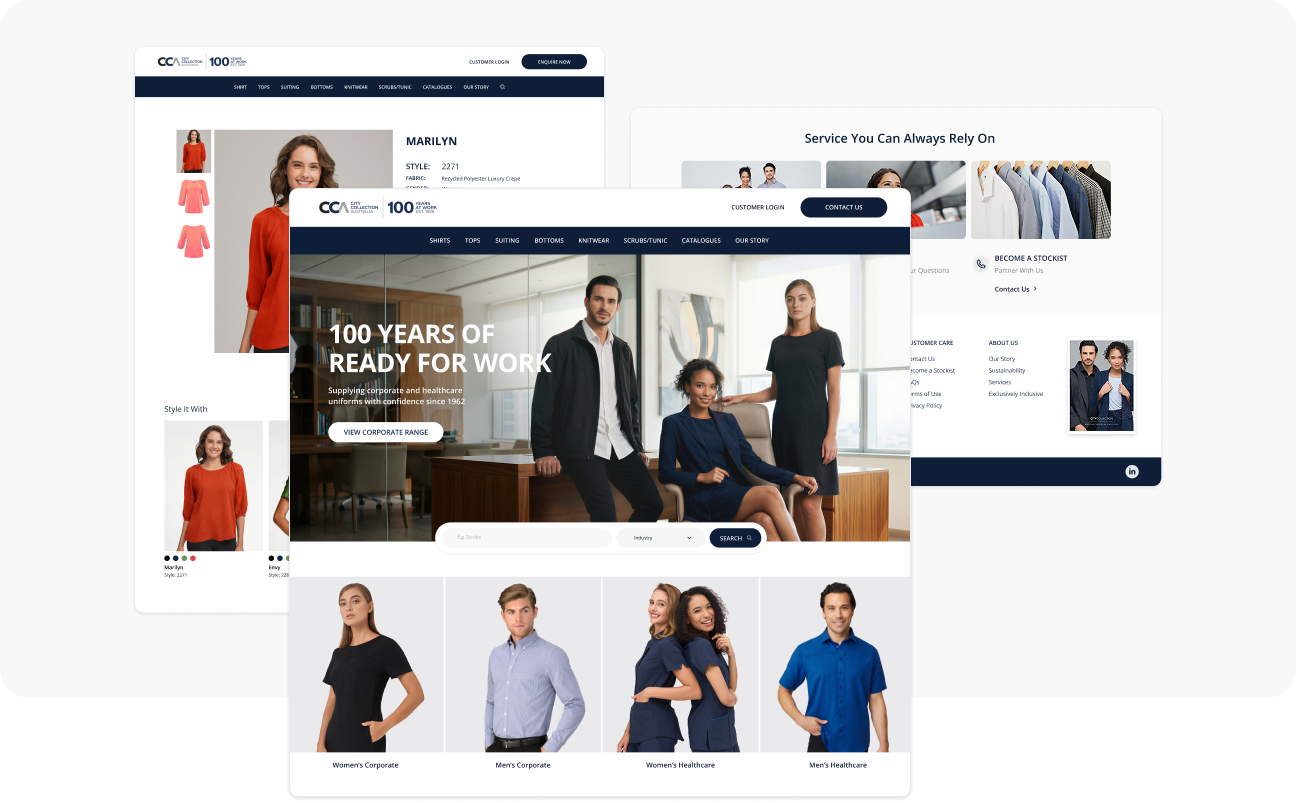
City Collection has supplied corporate and healthcare uniforms across Australia and New Zealand since 1926. Despite the brand's century-long heritage, its digital presence hadn't kept pace, the previous site struggled to reflect the brand's credibility, made it hard for B2B buyers to navigate between healthcare and corporate ranges, and wasn't built to support the SEO, content, and reseller-partnership goals the business needed going forward.
I led the project end-to-end: digital strategy, UX/UI design, and project management of the development build, working alongside a developer to bring the new site to launch.
The brand's biggest asset, 100 years of trust, wasn't visible anywhere on the old site. Beyond that:
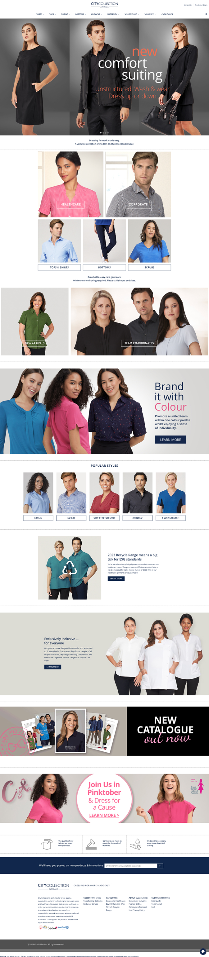
· Navigation didn't clearly separate the different buyer journeys, healthcare and corporate uniform ranges each have different needs and decision criteria, but the old site treated them as one flat catalogue.
· Product browsing had no real filtering, buyers scrolled flat grids with no way to narrow by colour, fabric, or garment type
· FAQs were a single unstructured list of 18+ questions with no categorization, making it hard to find an answer quickly
· The site wasn't structured to support an SEO and content strategy, limiting organic visibility against competitors
· There was no clear path for prospective resellers or stockists to engage with the brand
Coordinated with the developer through the WordPress/Elementor build phase, reviewing implementation against design specs, troubleshooting layout and responsive issues, and managing the DNS migration to the live domain.
Digital Strategist, UX/UI Designer, and Project Lead
April - June 2026
Wordpress / Elementor


· Competitor analysis of other corporate and healthcare uniform suppliers in the AU/NZ market
· SimilarWeb and GA4 cross-referencing to understand where traffic was coming from and where it was leaking
· Search Console interpretation to identify which queries the brand should be ranking for but wasn't
· Mapping the distinct buyer paths, healthcare procurement vs. corporate uniform buyers, to understand where their needs diverged in navigation, content, and product filtering

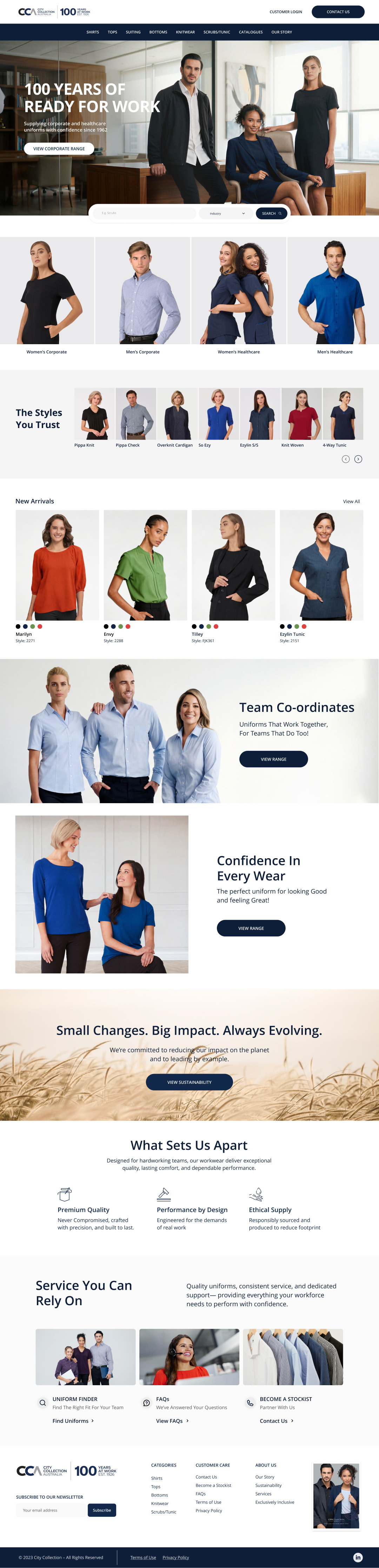
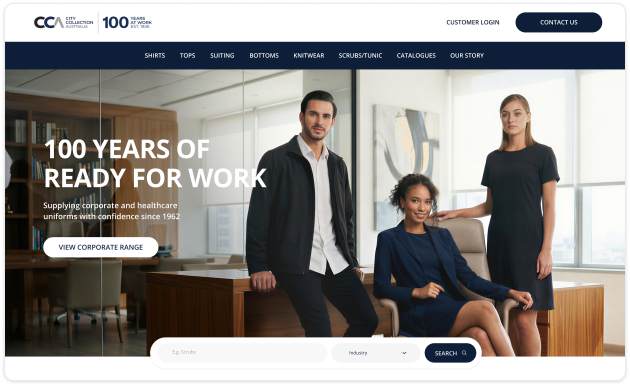
The "100 Years of Ready for Work" positioning became the hero message, leading with trust and longevity rather than generic product imagery, something no competitor in the category was doing.
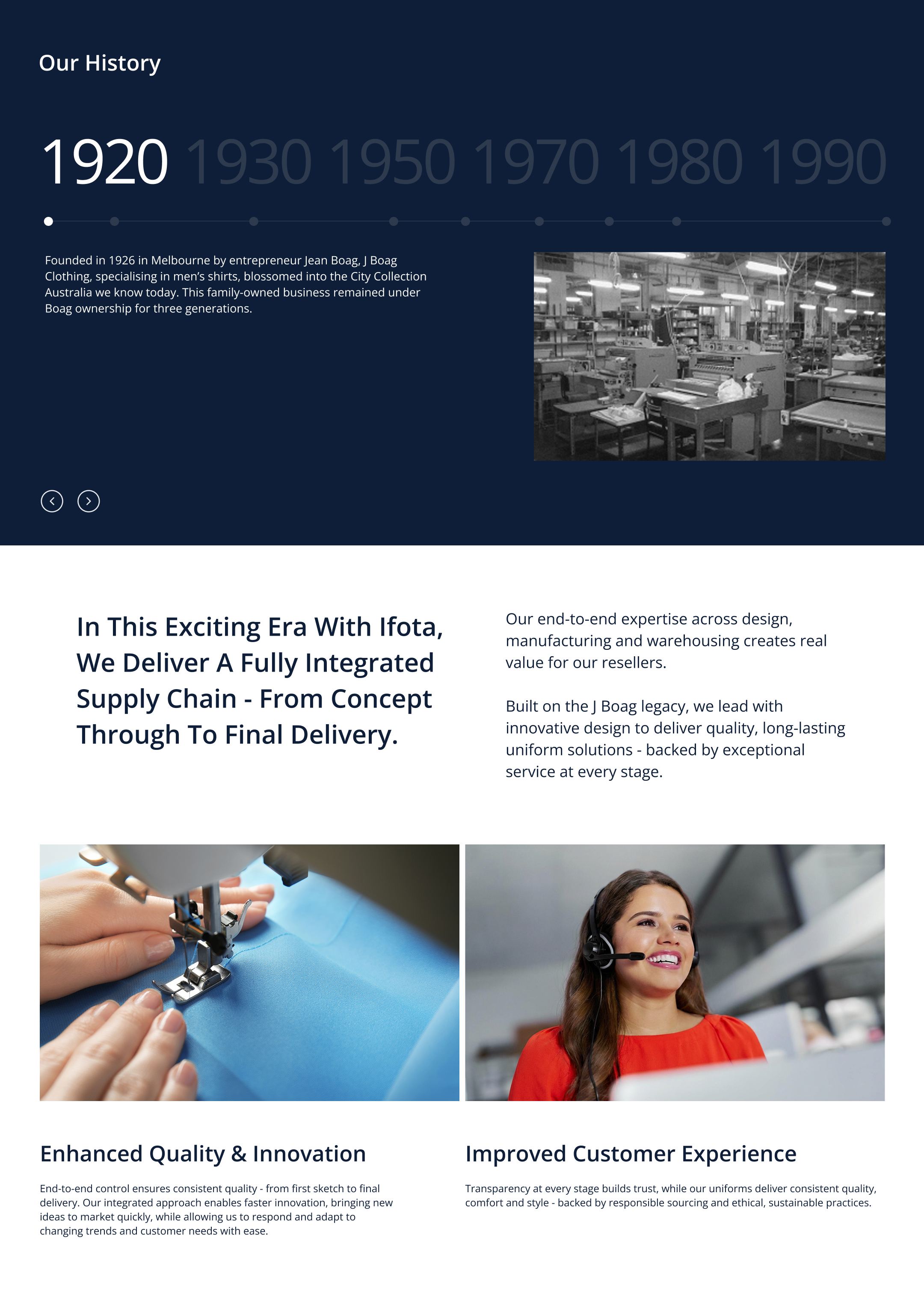
I also built out a dedicated "Our Story" page with an interactive decade-by-decade timeline covering the brand's founding in 1926 through to today, including its role producing uniforms for the 1956 Melbourne Olympic Games, giving the heritage claim real, explorable substance instead of a single tagline.
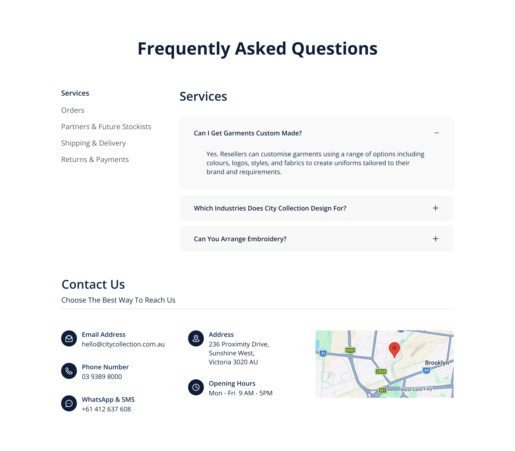
Rebuilt the FAQ page from one long unsorted list into five clear categories (Services, Orders, Partners & Future Stockists, Shipping & Delivery, Returns & Payments) with a sidebar for quick navigation, cutting down the time it takes a buyer to find a specific answer.

Replaced the old flat product grid with faceted filtering by colour, fabric, garment length, and pattern, addressing a real usability gap where buyers previously had no way to narrow 150+ products down to what they actually needed.
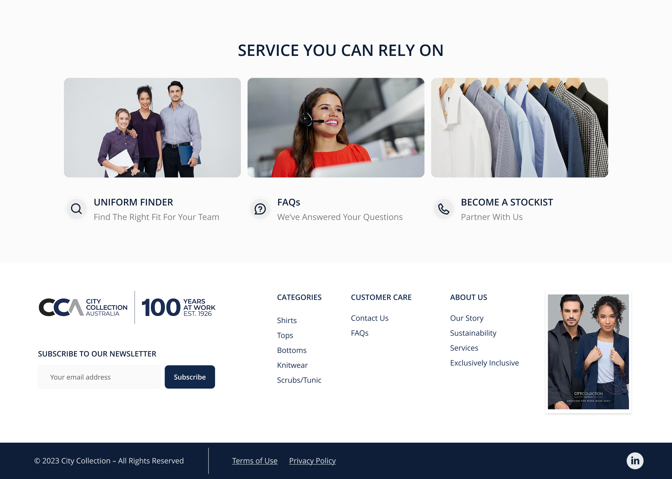
Added a "Partnership Pathway" touchpoint consistently across the footer and a dedicated content block, addressing the lack of a clear reseller engagement path identified in research.

Every major decision, the categorized FAQs, the sustainability page, traced back to a specific finding from the competitive and analytics audit rather than a visual preference. Grounding design in research made each choice easier to defend and easier for the developer to build against.

The challenge was leading with 100 years of brand trust without the site feeling dated. Pairing the heritage storytelling (the "100 Years" positioning, the interactive timeline) with genuinely modern UX patterns, faceted filtering, a guided search modal, meant the brand could feel both established and current at the same time.

Leading the research, the design, and the project management of the build meant constantly translating between three different concerns at once, what the data suggested, what the interface needed, and what was realistically buildable. Holding all three made the final result more coherent than handing off between separate people would have.

