
Logo Design & Graphic Design · Force of Nature · April 2025🔗 GrowthSignal

GrowthSignals, a sub-brand of Force of Nature, is an investor-grade growth intelligence that helps businesses unlock growth by identifying and interpreting key marketing signals and the brand’s public data (like SEO, paid media visibility, website performance, and market positioning). The brand identity project needed to convey data clarity, natural momentum, and professional expertise in a clean, modern, and minimalist way.
The goal of the project was to create a professional, minimalist, and modern logo for GrowthSignals that visually communicates the core concept of detecting growth-driving signals by:
1. Reflecting the dual essence of "signals" (data, insight, precision) and "growth" (momentum, evolution, progress).
2. Integrating the endorsement “by Force of Nature” in a clean, cohesive way.
3. Be a scalable, versatile, and consistent with the brand’s digital presence and minimalist aesthetic
4. Deliver a strong, memorable visual identity that aligns with the tone and functionality of the website.
Logo Designer
April 2025
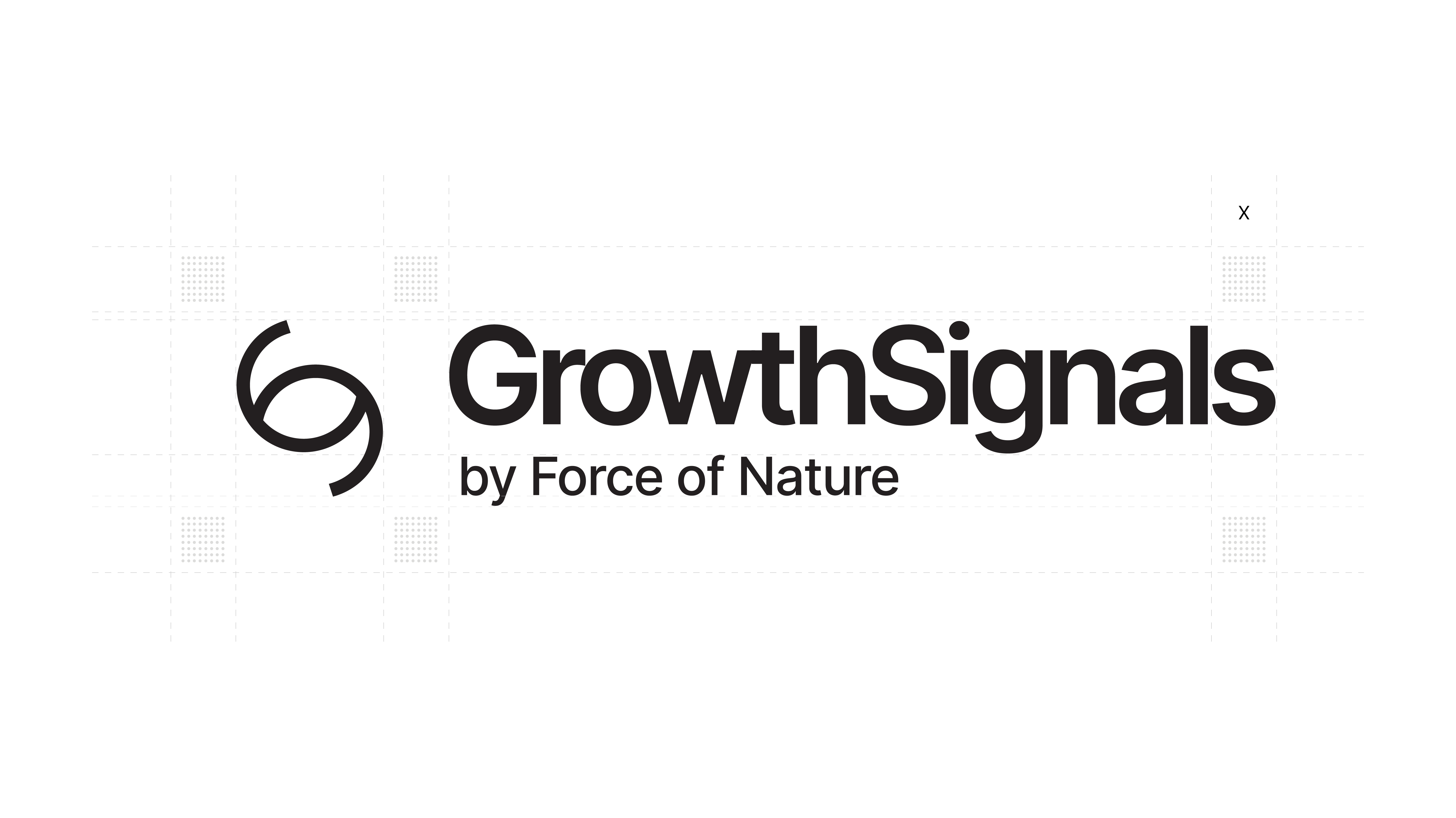
The GrowthSignals brand logo is developed to embody the idea of “signals leading to growth”. The interlocking form of G and S (Growth + Signal) explicitly creates a radar-like symbol that reinforces the inseparable link between actionable insights and expansion.
More than just a literal symbol, the mark represents the full cycle from data discovery, actionable insights, to business growth, perfectly evoking what GrowthSignals delivers as a marketing analytics company.


The brand logo is purposely designed as a visual promise that GrowthSignals will detect actionable opportunities for business growth.
By positioning “by Force of Nature” under the main logotype in a balanced typographic heirarchy, the design acknowledges its parent brand without drowning the new brand identity created.
The bold black, white, and gray palette, characterized by a vibrant green accent reinforces confidence in delivering their brand promise and as well as ensuring a strong differentiation with competitors.