
Brand Identity and Packaging Design · Yogurt Culture · September 2022
Yogurt Culture is a local brand and producer of yogurt, yogurt drinks and desseerts that offers a healthy and great-tasting way of experiencing yogurt. Looking into the future, the Yogurt Culture wants to recreate a brand that could compete with known multinational yogurt brands in the shelf at a glance.
As a local brand, the goal of the design project was to create a distinctive yet simple brand identity and packaging that captures a memorable essence while achieving the quality that could compete with multinational brands. The design focuses on a clean, modern, and highly recognizable look that resonates with local consumers and reflects premium quality. Through bold typography, minimal layouts, and vibrant, realistic fruit imagery, it aims to clearly differentiate flavors, enhance shelf presence, and communicate freshness and quality at a glance.
Brand Identity and Packaging Design
September 2022

The Yogurt Culture logo combines clarity with warmth using bold, lowercase lettering in a clean sans-serif typeface for maximum legibility and versatility across applications.
Its simple, balanced design ensures strong visibility on shelves and screens, while the approachable letterforms and modern composition convey freshness, quality, and trust. This blend of precision and personality makes the logo highly effective and instantly recognizable yet polished enough to stand alongside leading international brands on supermarket display shelves.

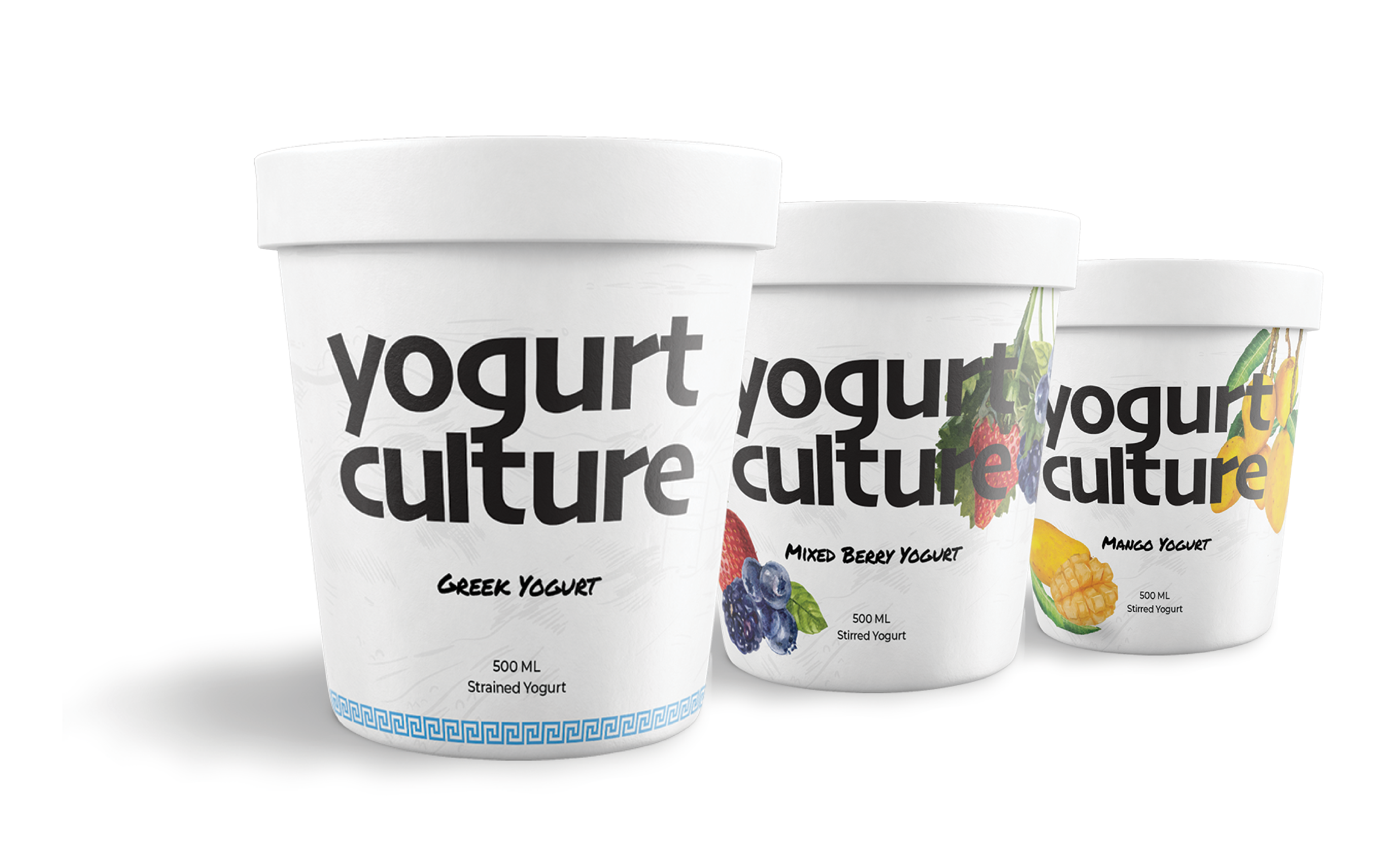
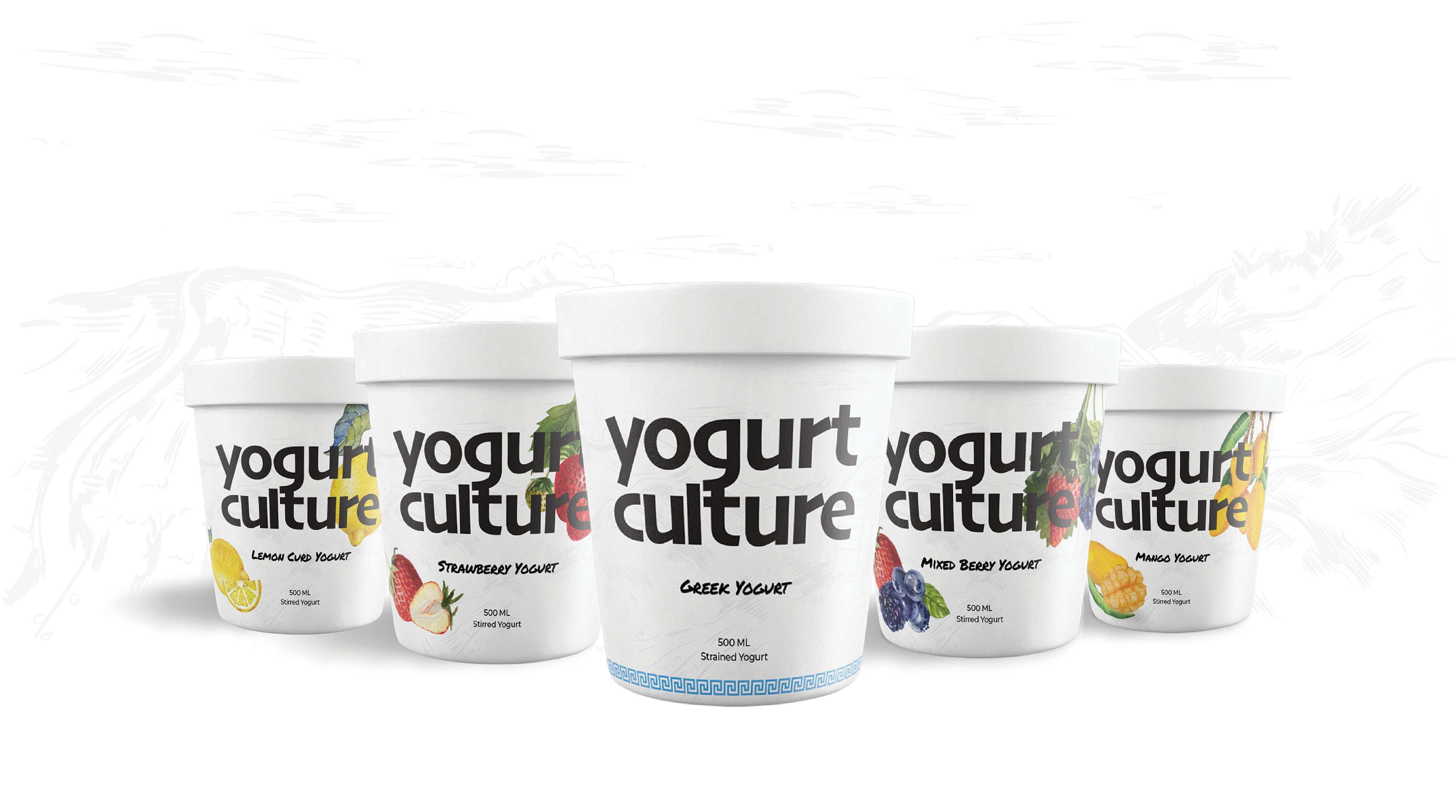
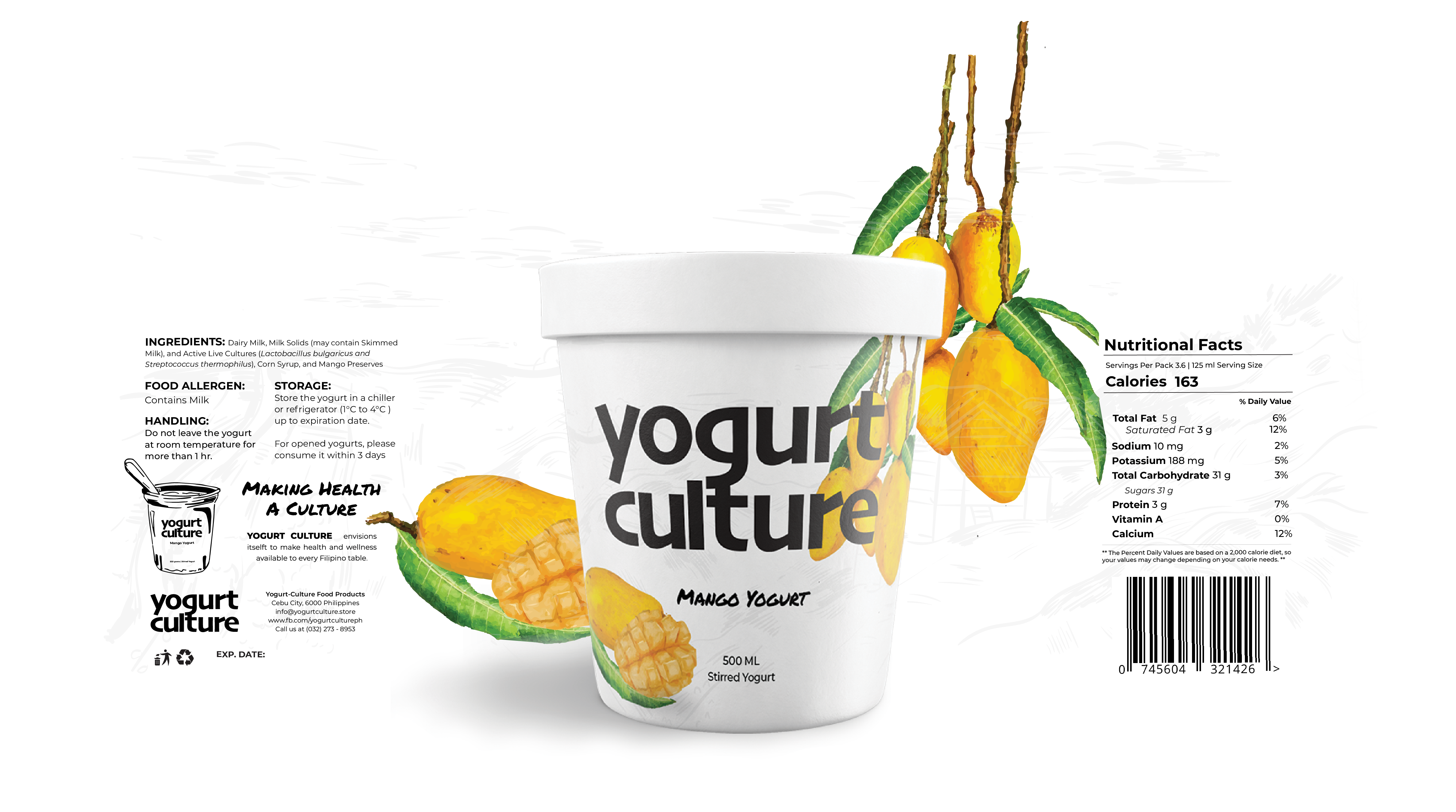
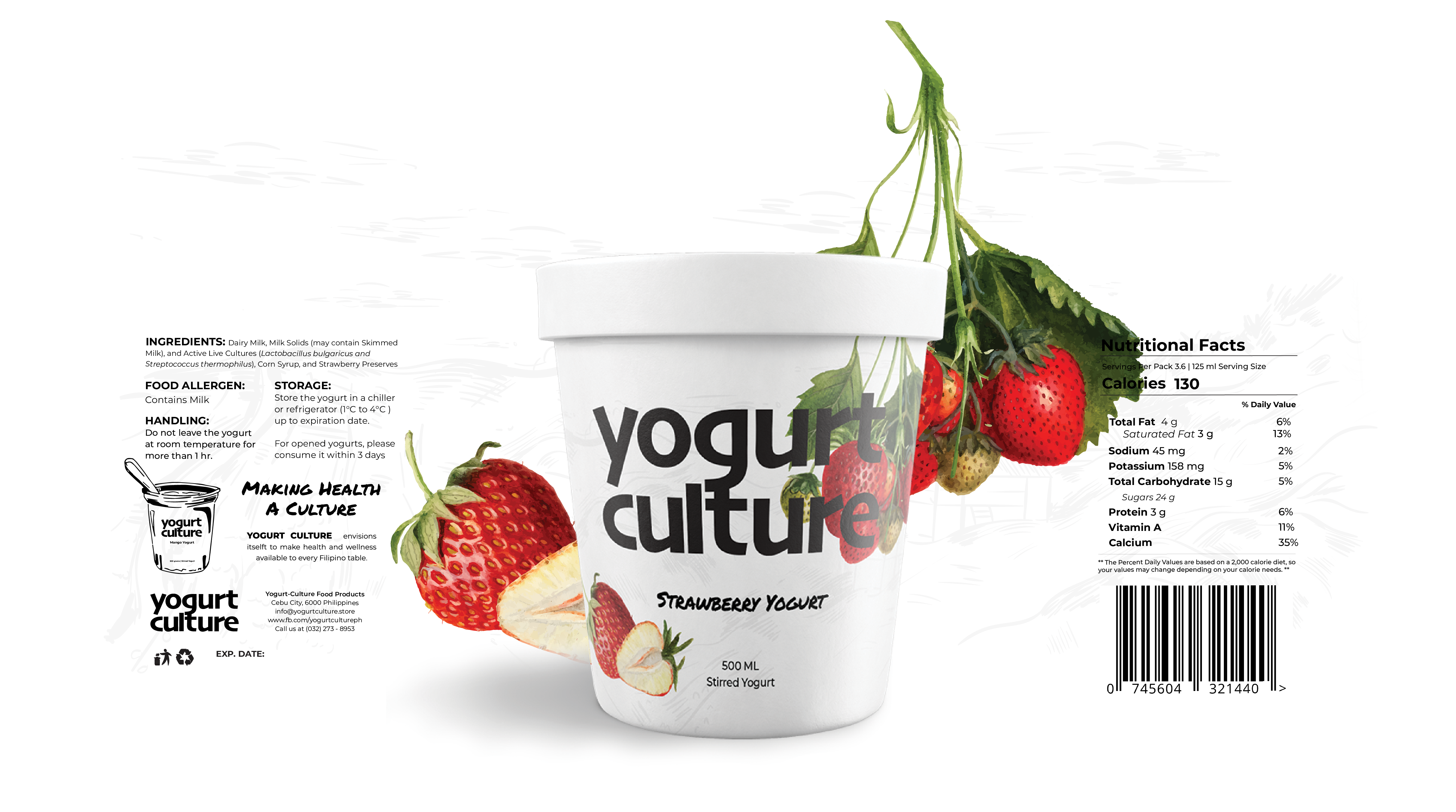
The Yogurt Culture packaging design blends minimalism with vibrant flavor cues to create a look that is both visually striking and highly functional.
Each yogurt variant features bold, consistent typography for easy brand recognition, paired with realistic, high-quality fruit imagery that immediately communicates flavor and freshness.
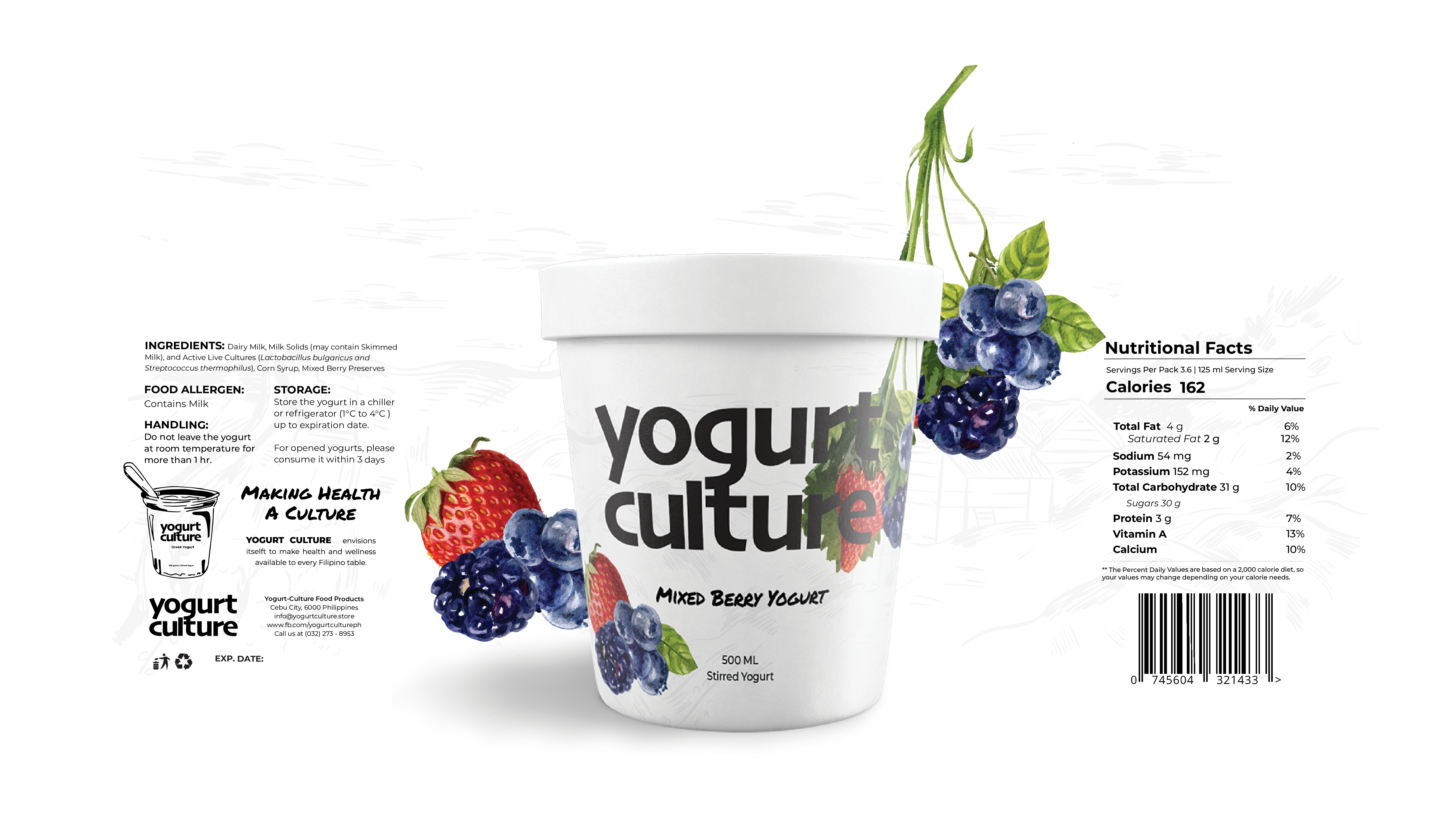
This cohesive system not only enhances brand recall but also projects the refinement and quality associated with international products, making it effective in capturing consumer attention and trust in competitive retail environments.


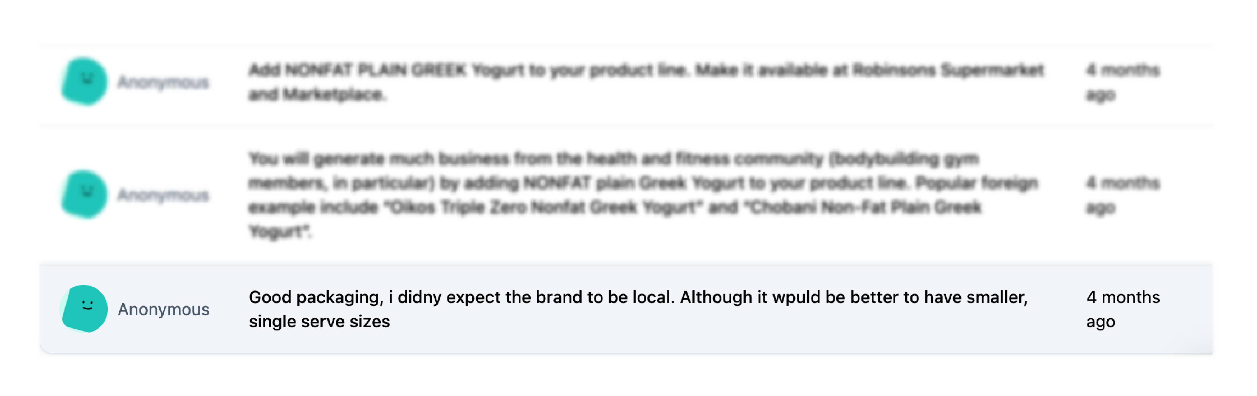
Based on a customer survey that was done, the packaging design received positive feedback, customers were surprised to learn it was from a local brand.

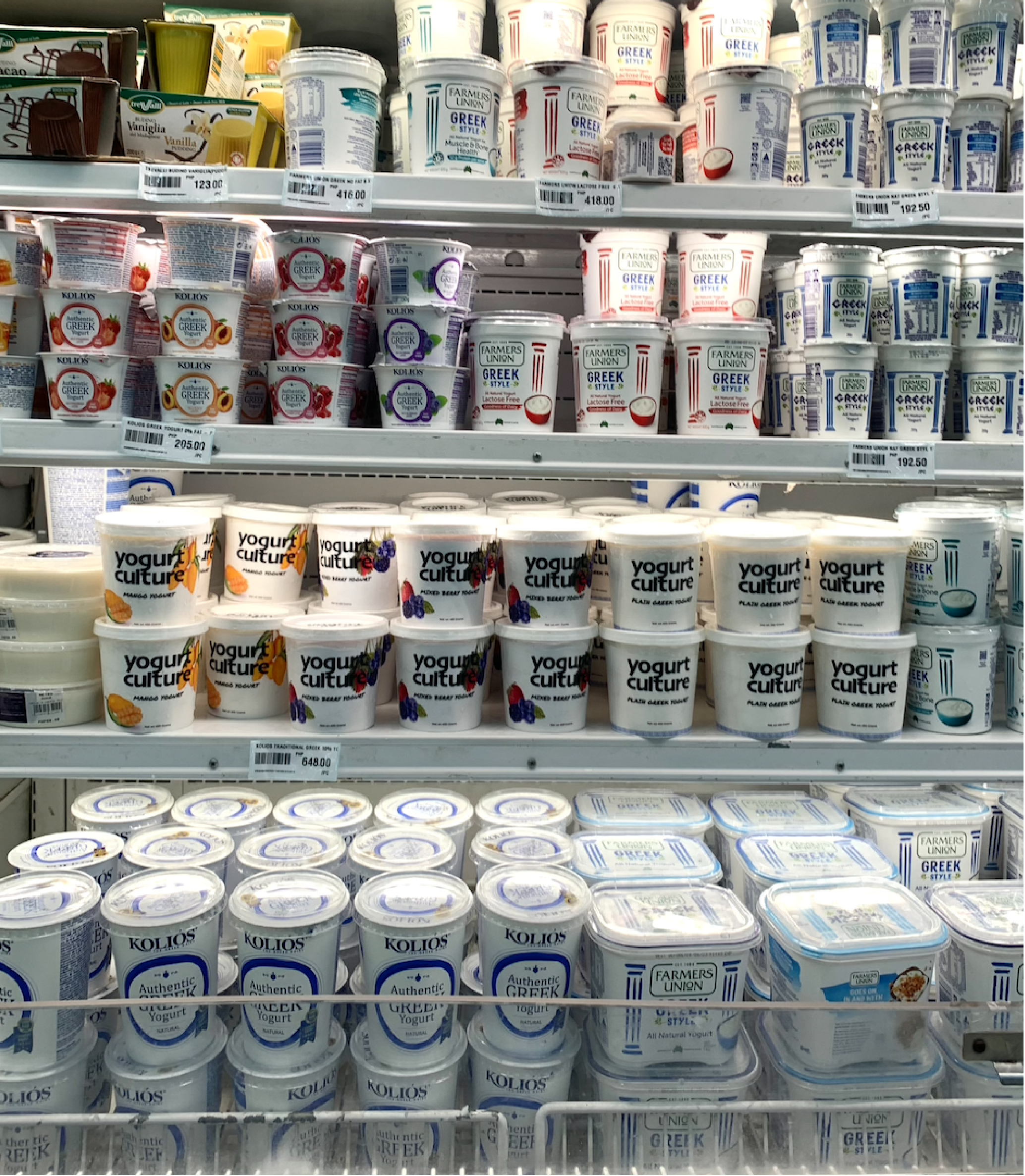

The clean, minimalist logo and consistent typography created a unified visual identity that is instantly recognizable and adaptable across applications especially in packaging.
A minimal layout paired with vibrant, fruit imagery delivered strong flavor cues that enhances customer appetite appeal, and ensure easy product differentiation and recognizability.
The refined, cohesive design established customer’s trust and elevated the product’s market presence in the shelves especially when comparing it to other brands.